Quick answer
How to plan pendant light size, quantity, spacing, hanging height, glass style, and finish preference for a kitchen island.
- Choose the number of pendants first
- Leave space between shades
- Keep the ends balanced
- Check hanging height with sightlines
- Match shade shape to the island
- Think about glare and bulb visibility
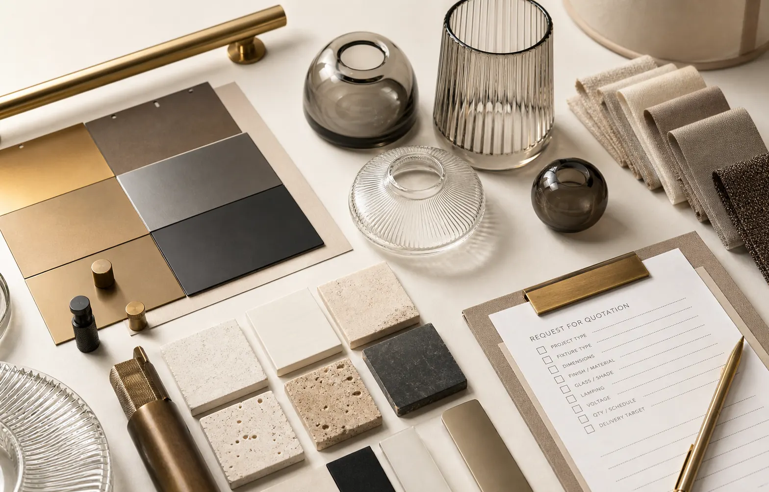
Choose the number of pendants first
Pendant spacing starts with quantity. Two larger pendants can feel calm and simple over a medium island. Three smaller pendants can create a more even rhythm over a longer island. The right choice depends on island length, shade width, ceiling height, and how much visual weight you want.
Leave space between shades
Pendants should not feel crowded together. Leave enough visual space between shades so each light has room to breathe. Wide glass shades, fabric shades, and metal domes need more space than slim pendants. Always compare shade width with the full island length before choosing.
Keep the ends balanced
The first and last pendant should not sit too close to the island ends. If the lights are pushed too far out, the layout can look stretched and awkward. If they sit too close together, the island may feel under-lit at the sides. Balance matters more than a single fixed number.
Check hanging height with sightlines
Kitchen island pendants should light the counter without blocking normal conversation or views across the kitchen. Ceiling height, cable length, rod length, shade height, and counter height all affect the final position. Review the full hanging height before choosing a product.
Match shade shape to the island
Long islands can handle repeated small pendants, linear pendants, or larger glass shades. Shorter islands usually look better with fewer pieces. Round, cone, cylinder, globe, and ribbed glass shades each create a different rhythm, even when the measurements are similar.
Think about glare and bulb visibility
Clear glass pendants often show the bulb directly, so bulb shape and brightness matter. Ribbed, smoked, or opal glass can soften the light but may change brightness. If the pendant sits near eye level, check whether the bulb or inner hardware will be comfortable to look at.
Compare finish with kitchen hardware
Pendant finish should work with cabinet pulls, taps, stools, appliances, and nearby lights. Brass can add warmth, black can add contrast, chrome can feel cleaner, and wood-tone details can soften the room. The finish should support the kitchen rather than feel like a separate object.
Review cleaning and daily use
Kitchen pendants sit near cooking, steam, fingerprints, and dust. Clear glass can show marks more easily, while ribbed or smoked glass may hide them better. Check shade access, removable parts, and product photos so the light looks practical for daily use, not only attractive in one image.
Next step
Choose one clear next step.
If you are still comparing styles, open the product page first. If you already know the product, finish, quantity, or room details you need, use the contact or quote path instead.